Research
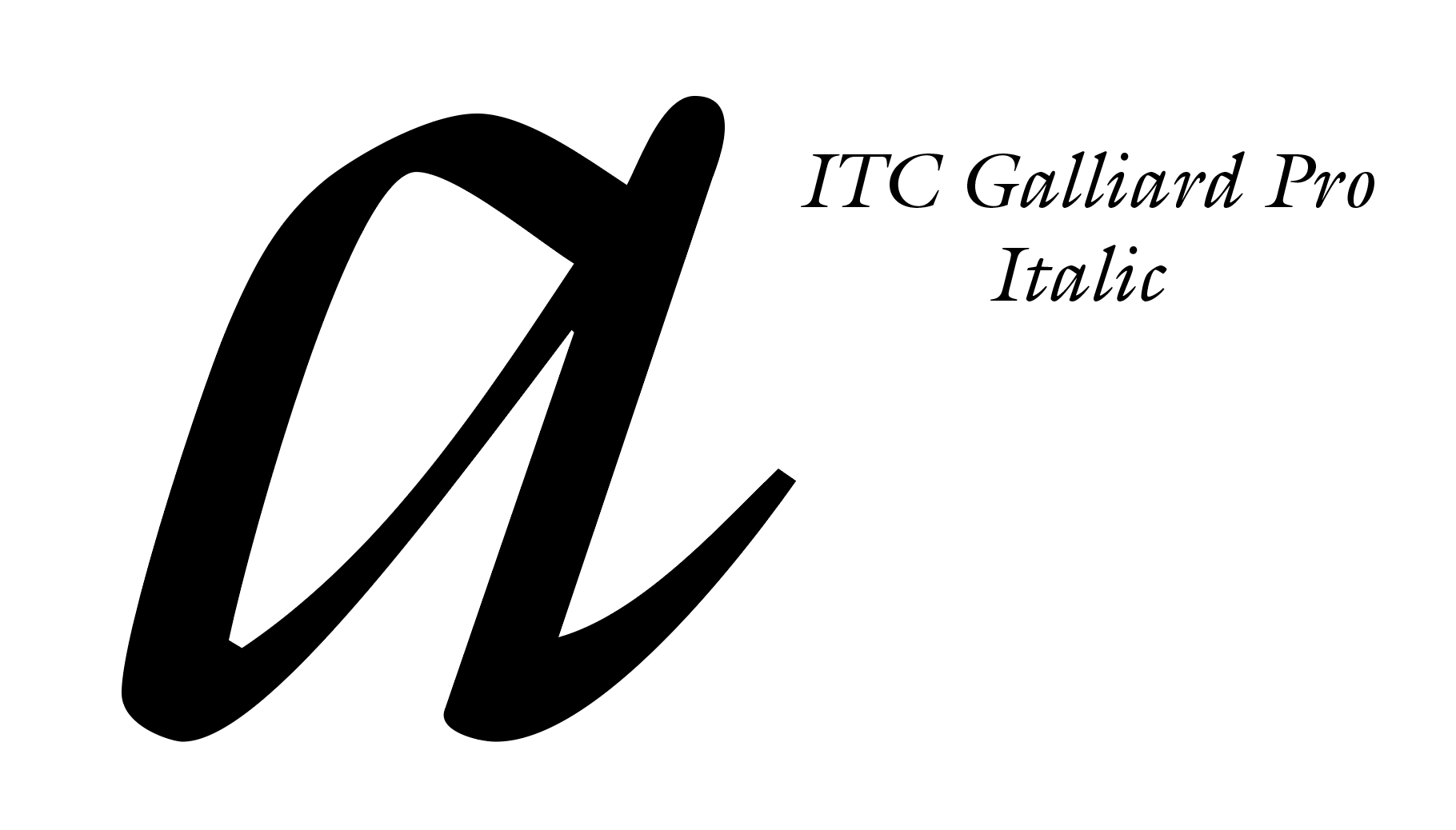
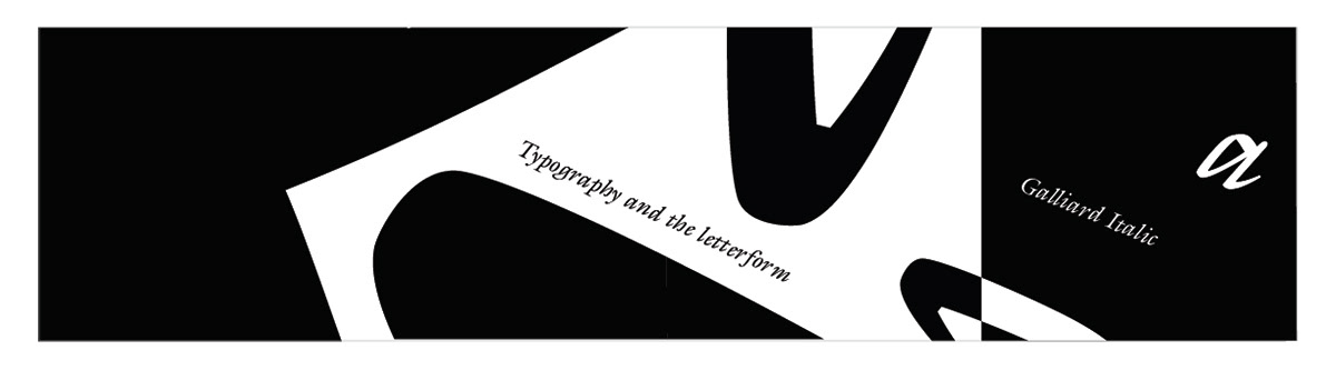
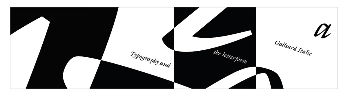
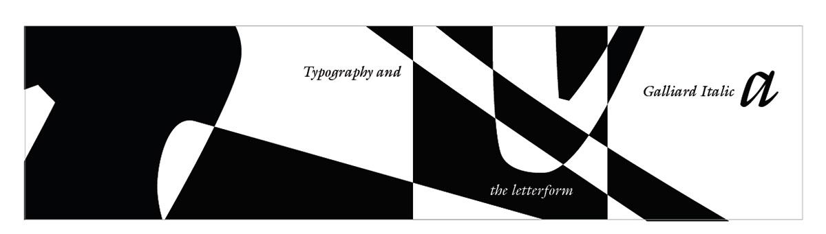
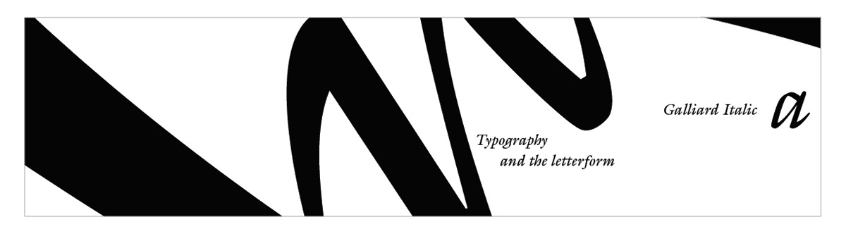
For researching, we were tasked with looking at many different types of fonts and picking one that we truly like that had unique, distinct attributes about it to create a nice abstract design that would gradually reveal the letter. The lower case italic a of Galliard pro had a unique lip to the end of its tail and the bulge of the a expanding out.
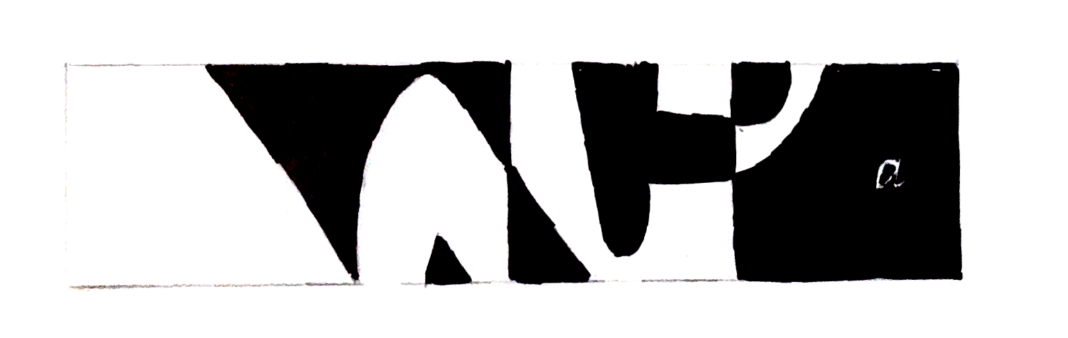
Sketching
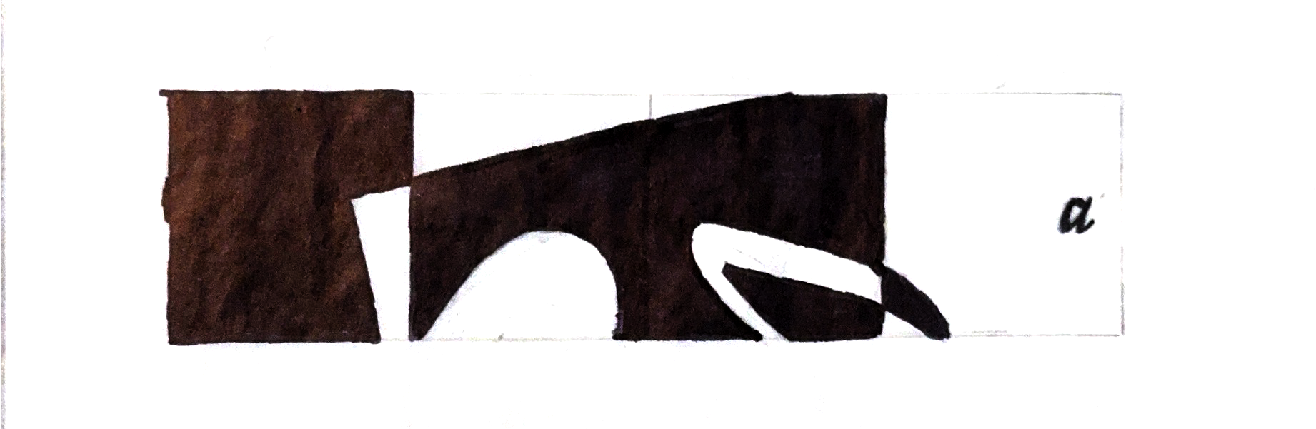
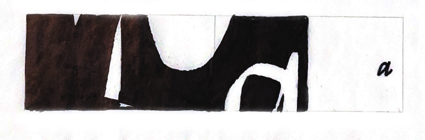
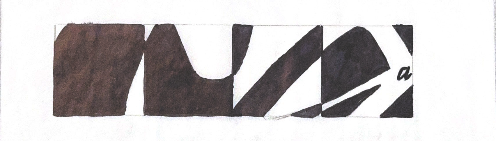
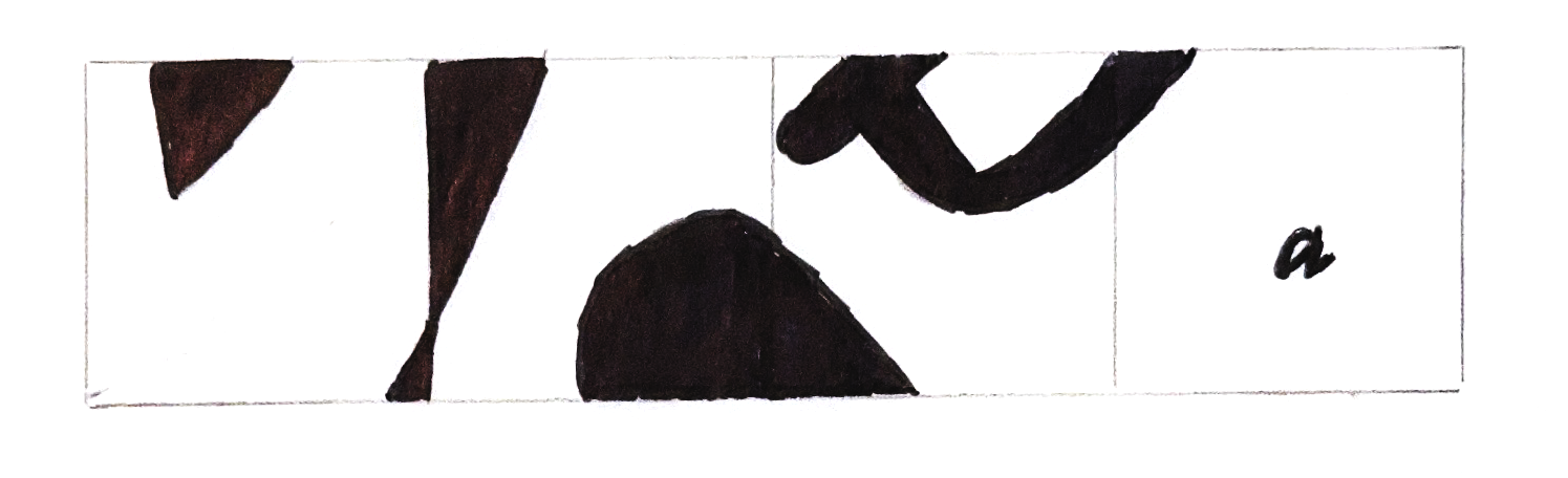
Sketching process of trying multiple different designs of the lowercase A's design to create an abstract four-panel sequence.
Sketch
Sketch
Sketch
Sketch
Sketch
Sketch
Sketch
Sketch
Sketch
Sketch
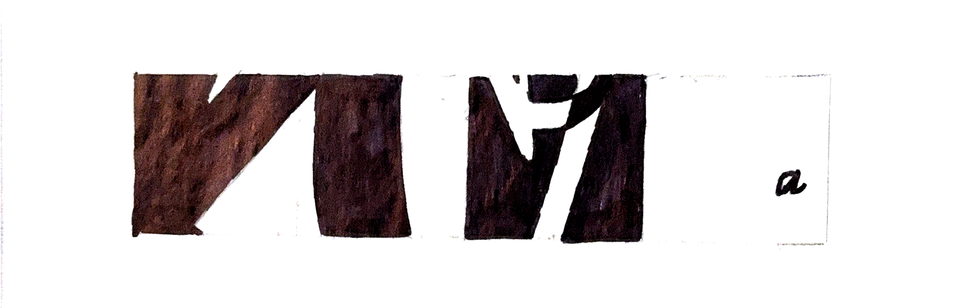
Digital Iterations
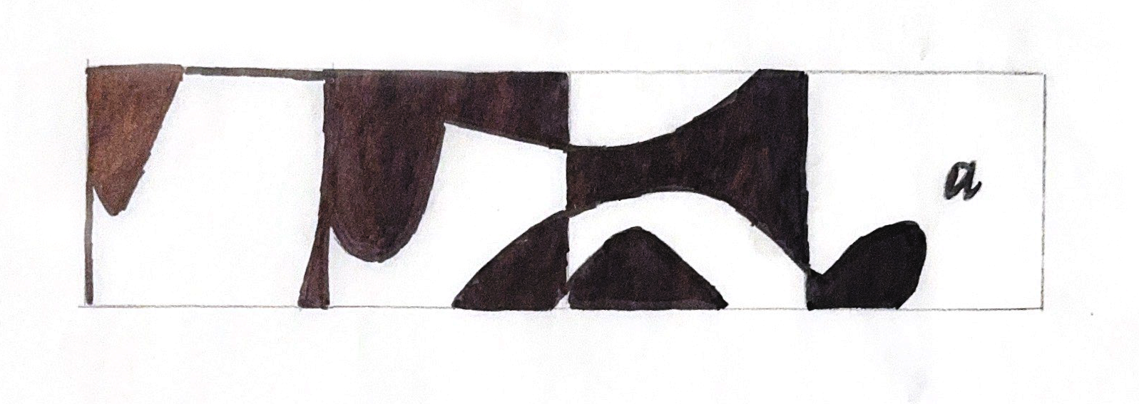
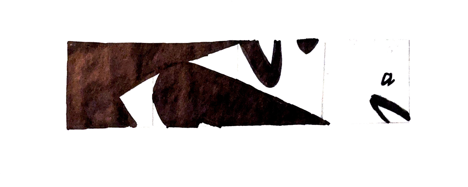
After sketching digital iterations, I designed multiple four-panel sequences in Adobe Illustrator, trying new and more creative ways to scale the letters and experimenting with different parts of the letters not shown in the sketches.
Ideation
Ideation
Ideation
Ideation
Ideation
Ideation

Ideation
Ideation
Ideation
Ideation
Ideation
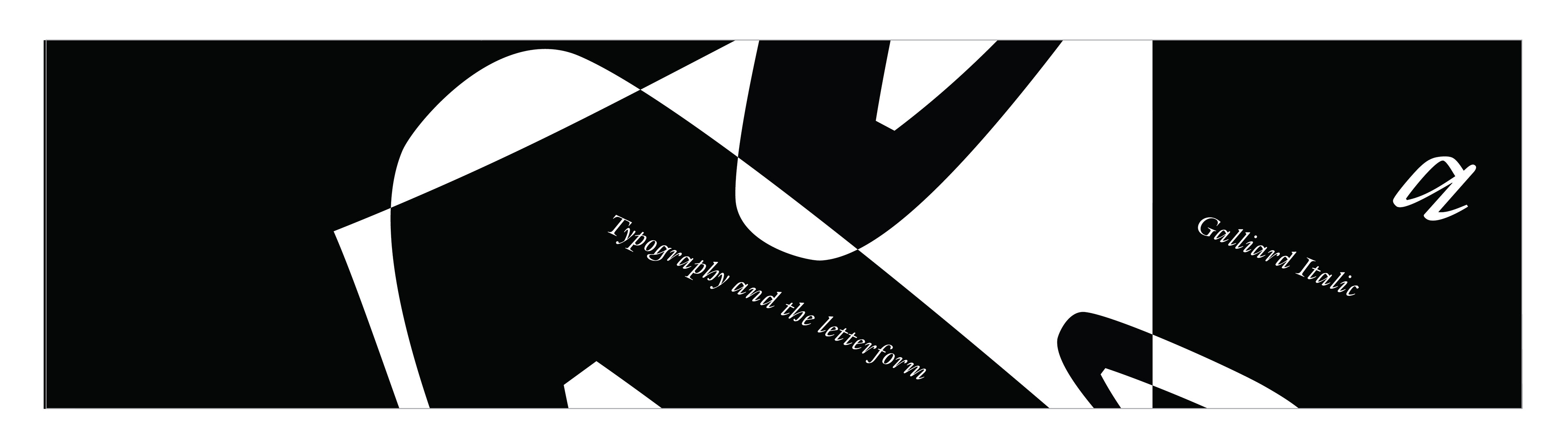
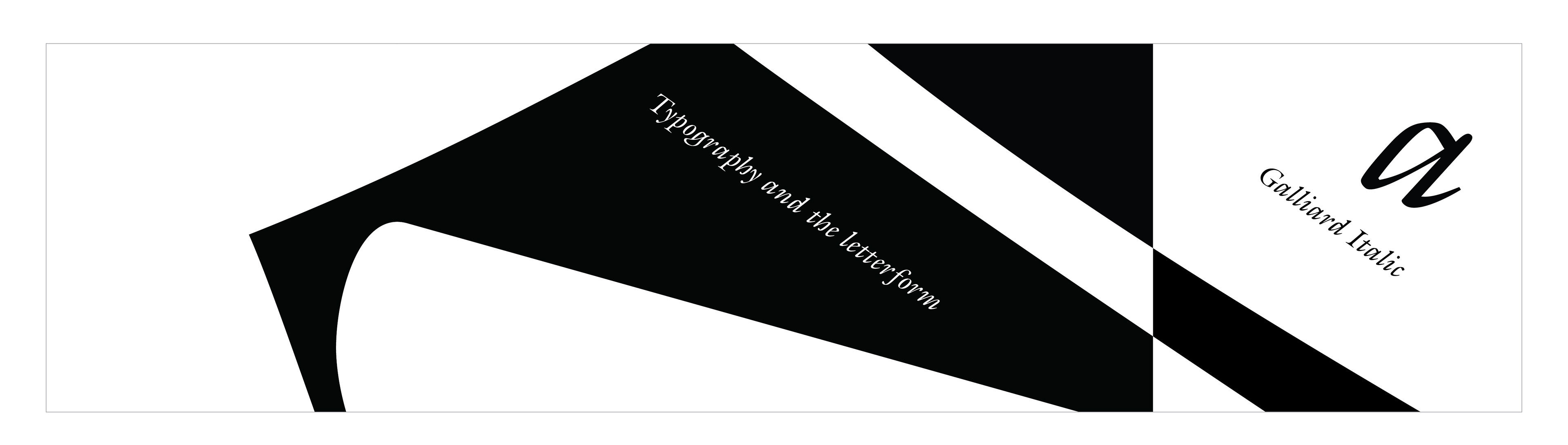
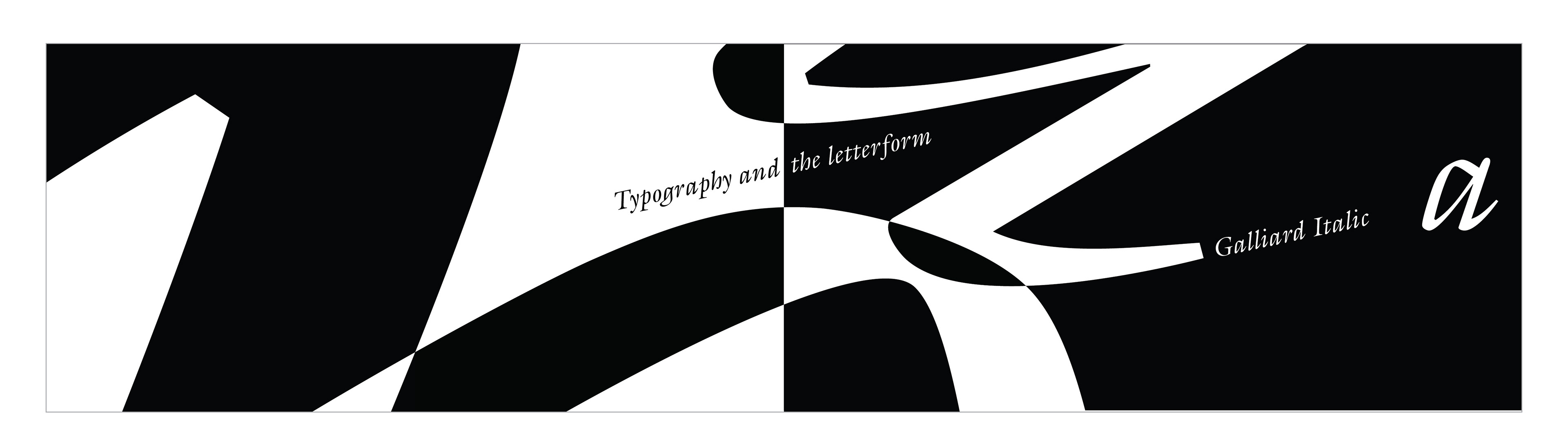
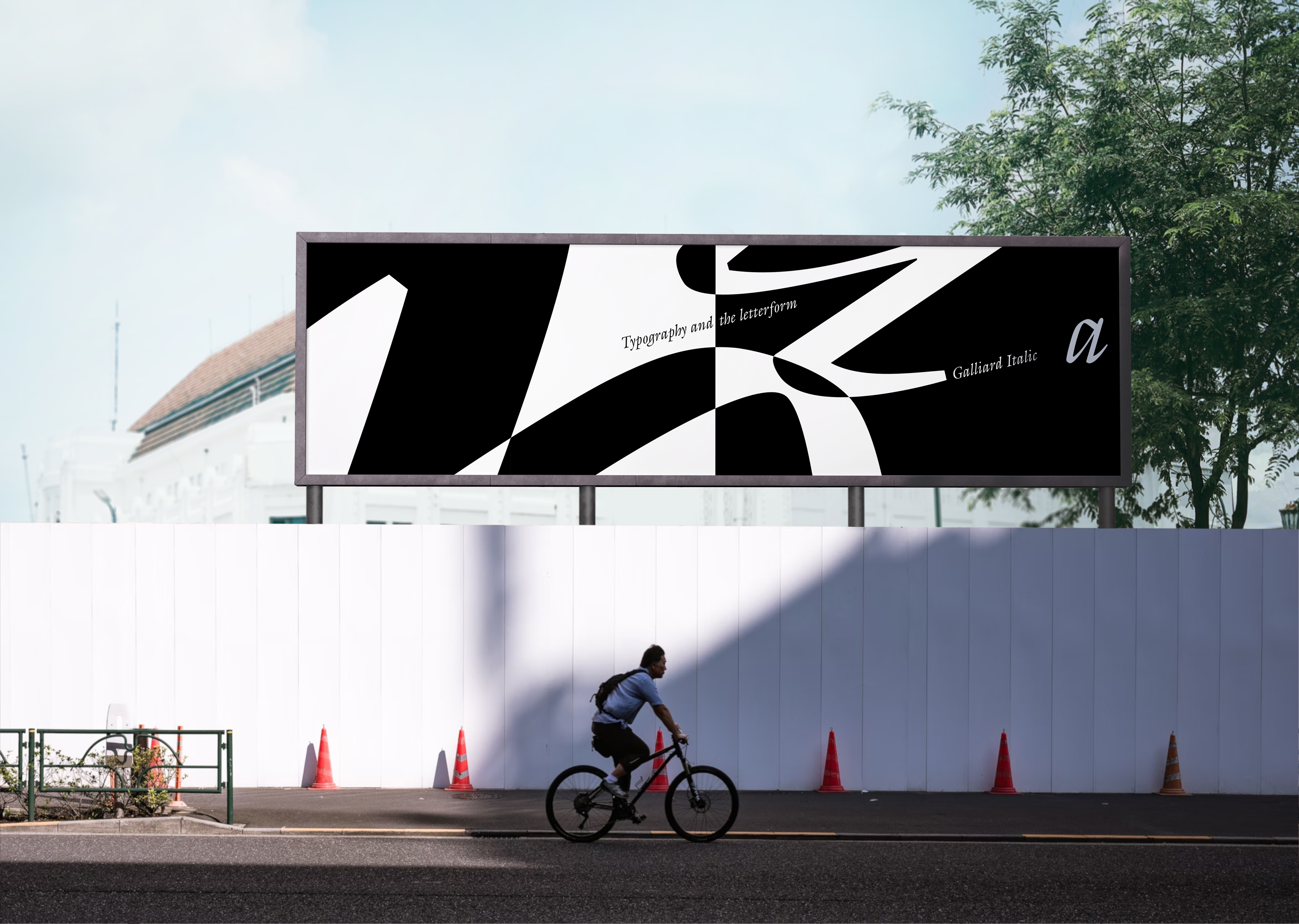
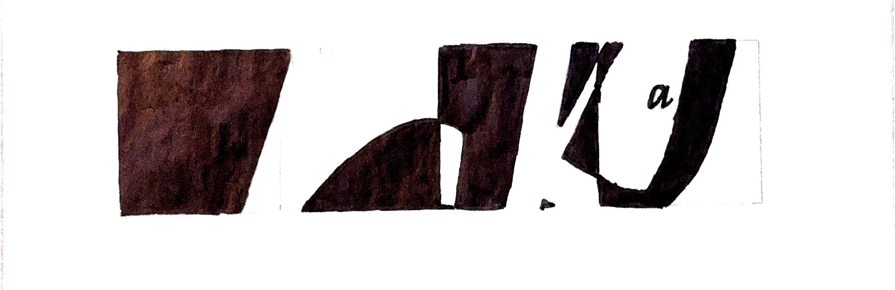
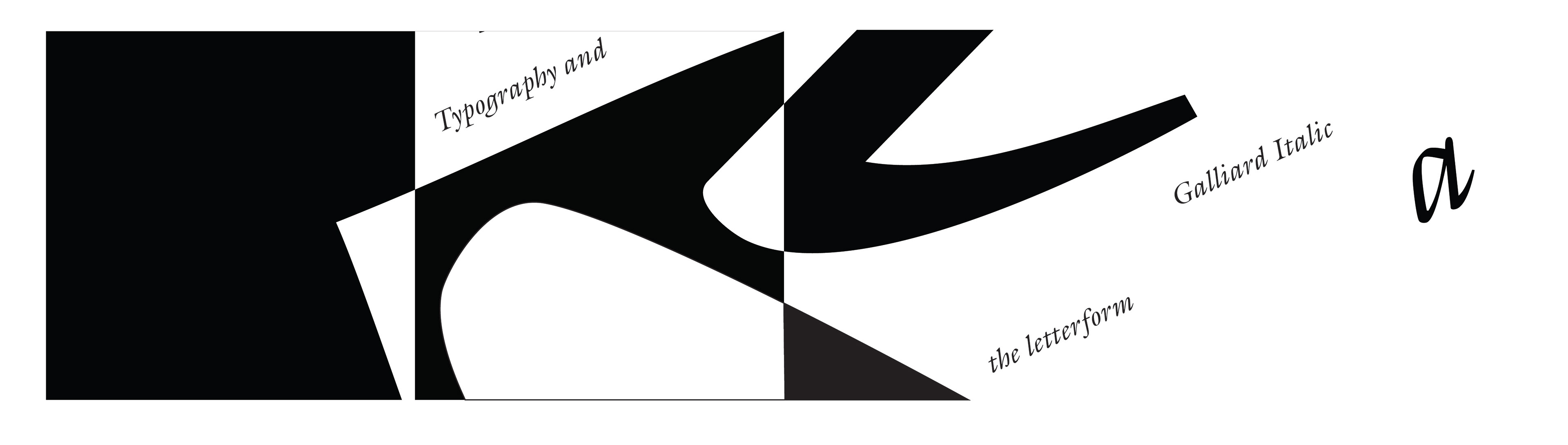
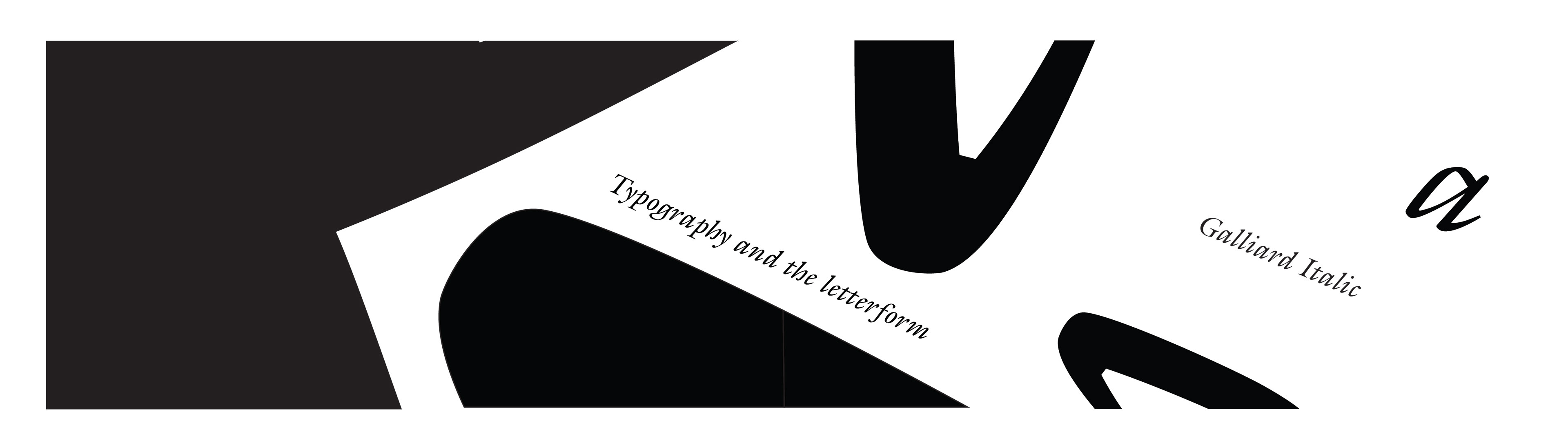
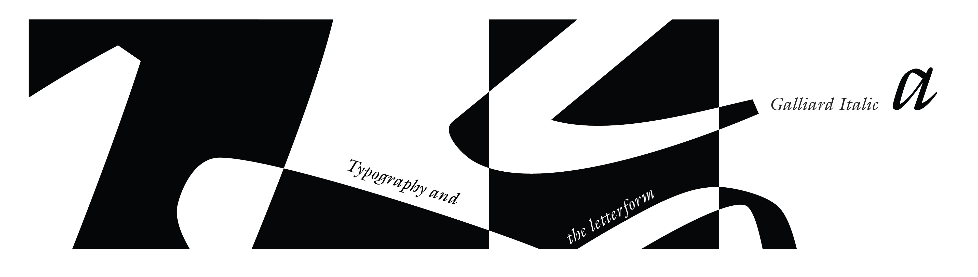
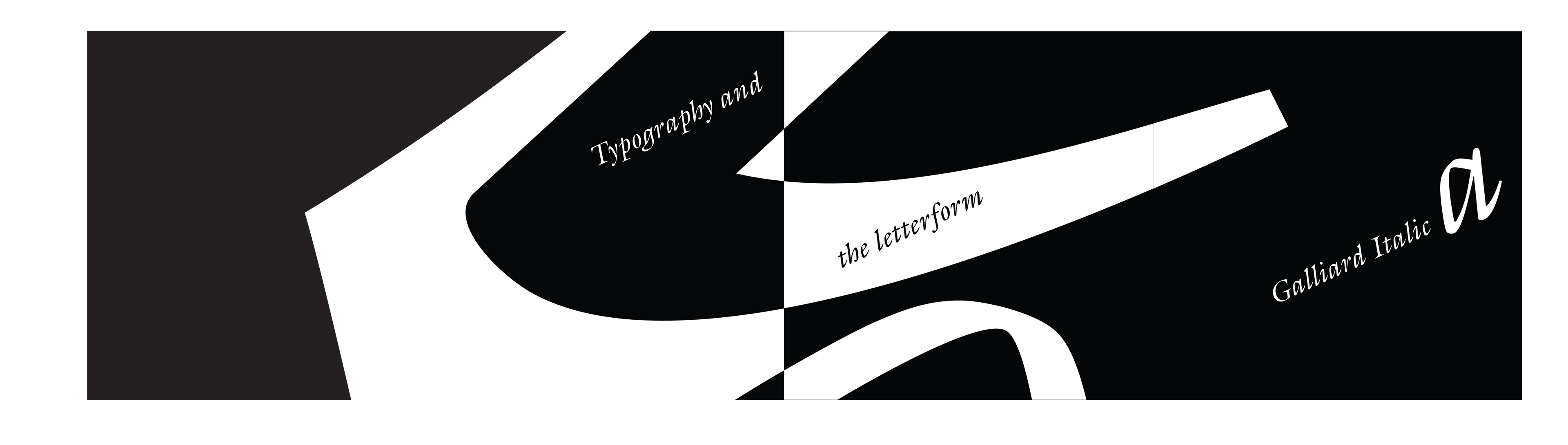
Refinement
Digital refinements of the iterations play with the sequence being more abstract and the reveal being worthy of surprise when the eye moves left to right, showcasing how every panel was created by a letter.
refinement
refinement
refinement
refinement
refinement
refinement
refinement
refinement
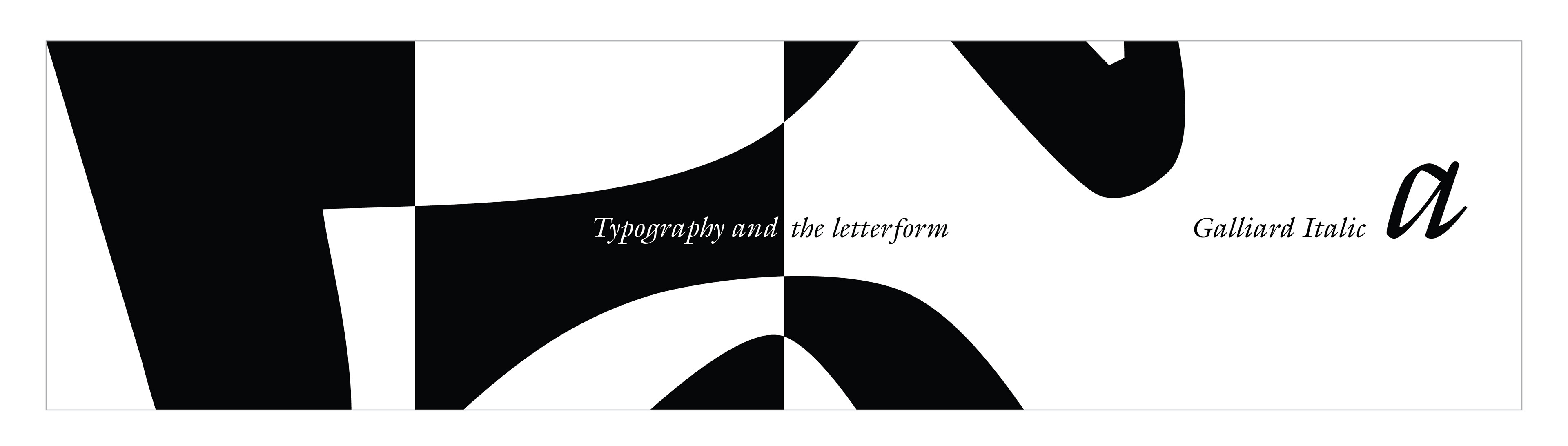
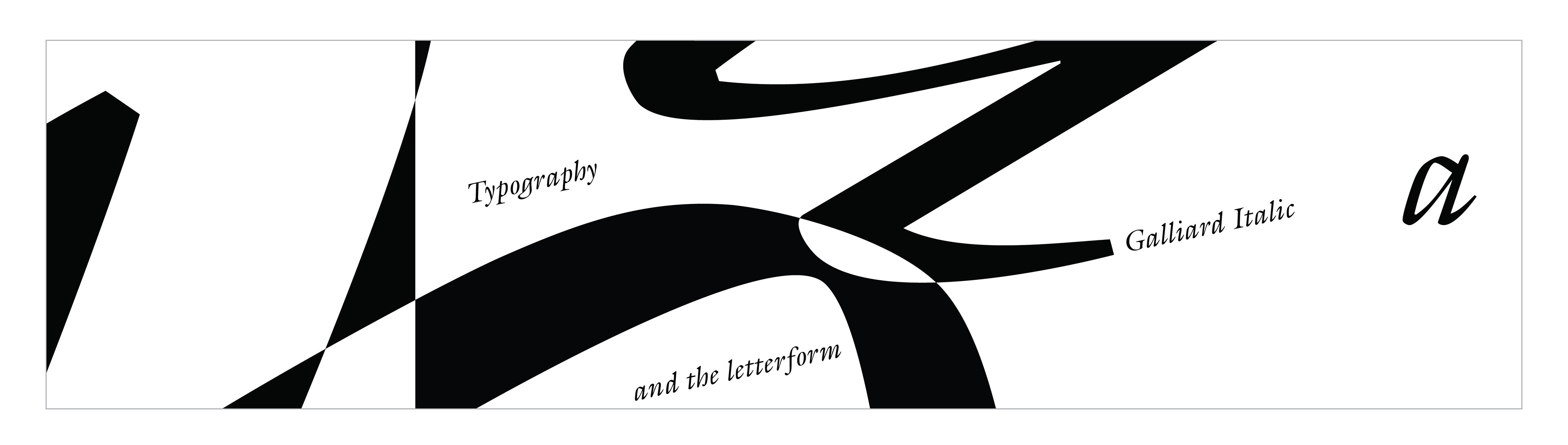
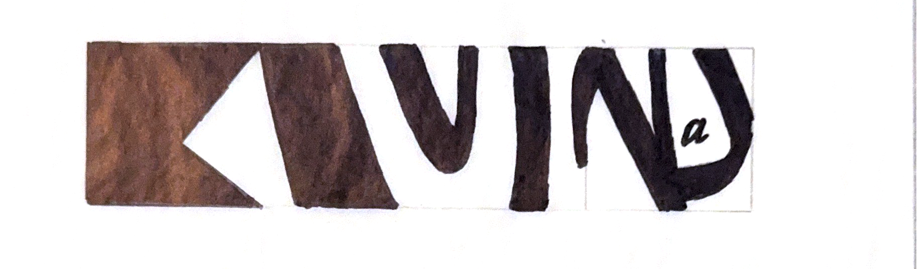
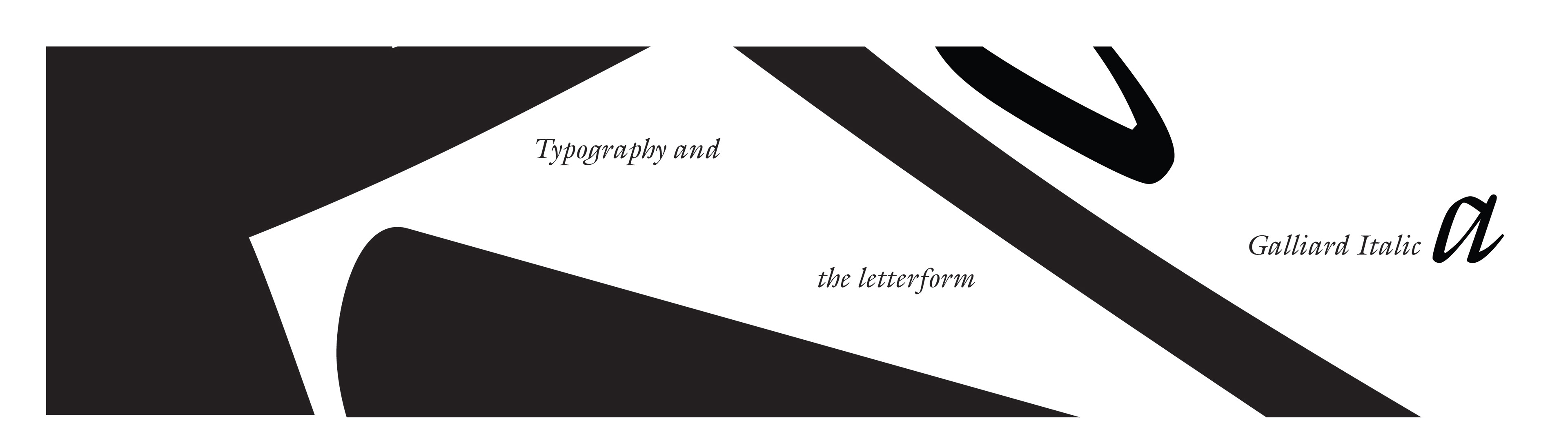
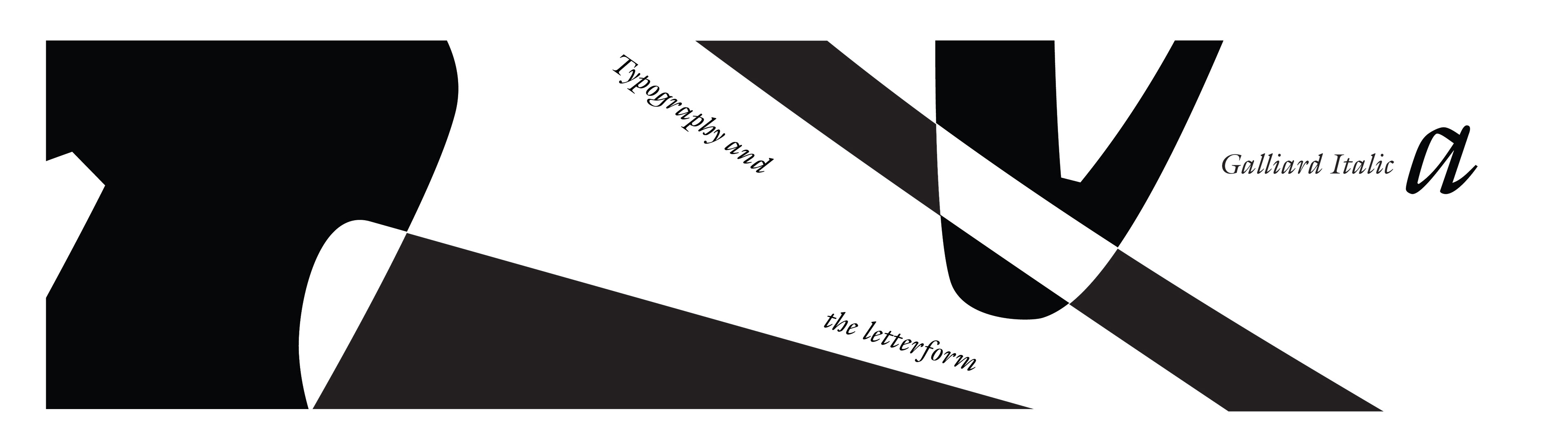
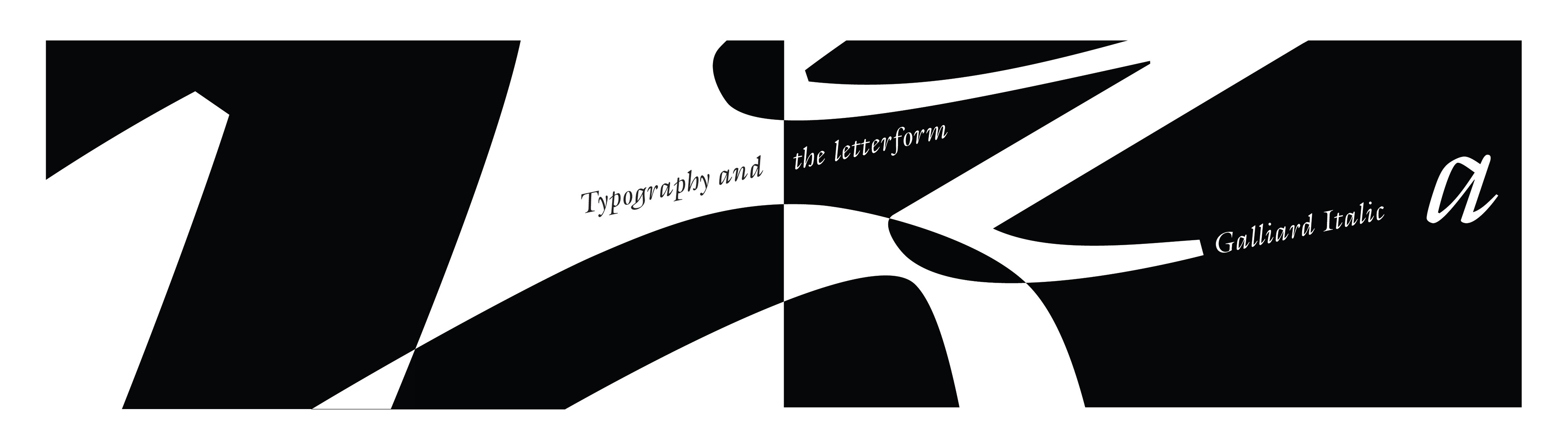
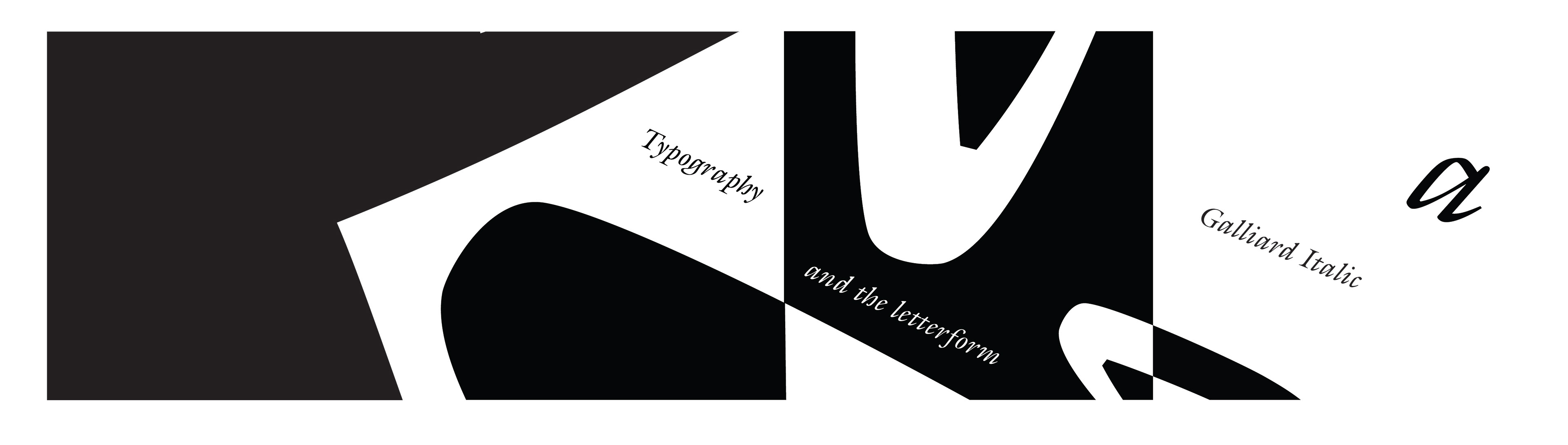
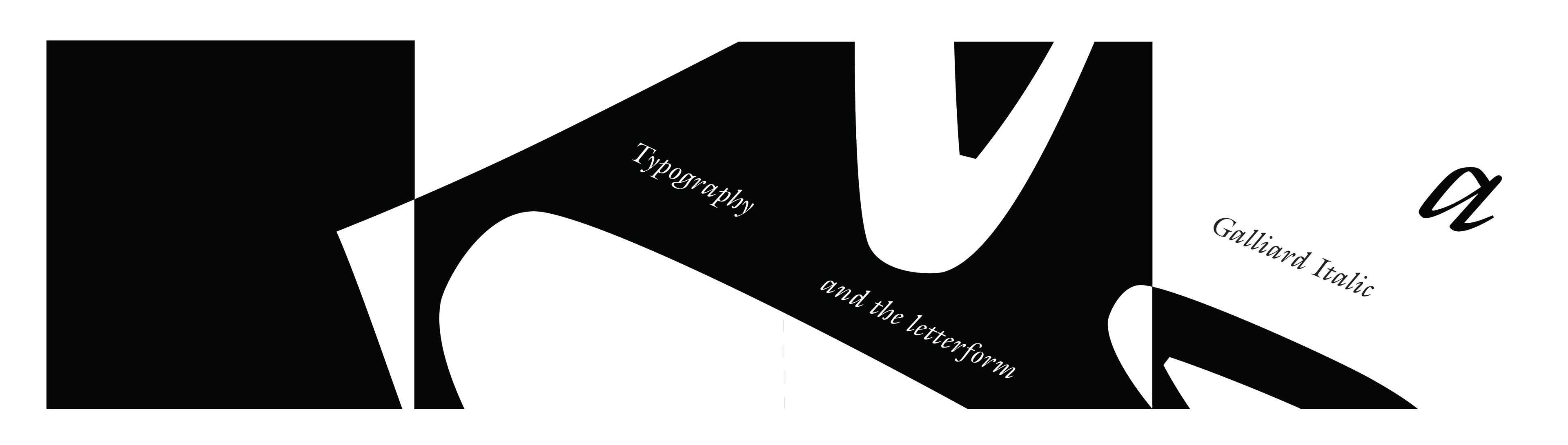
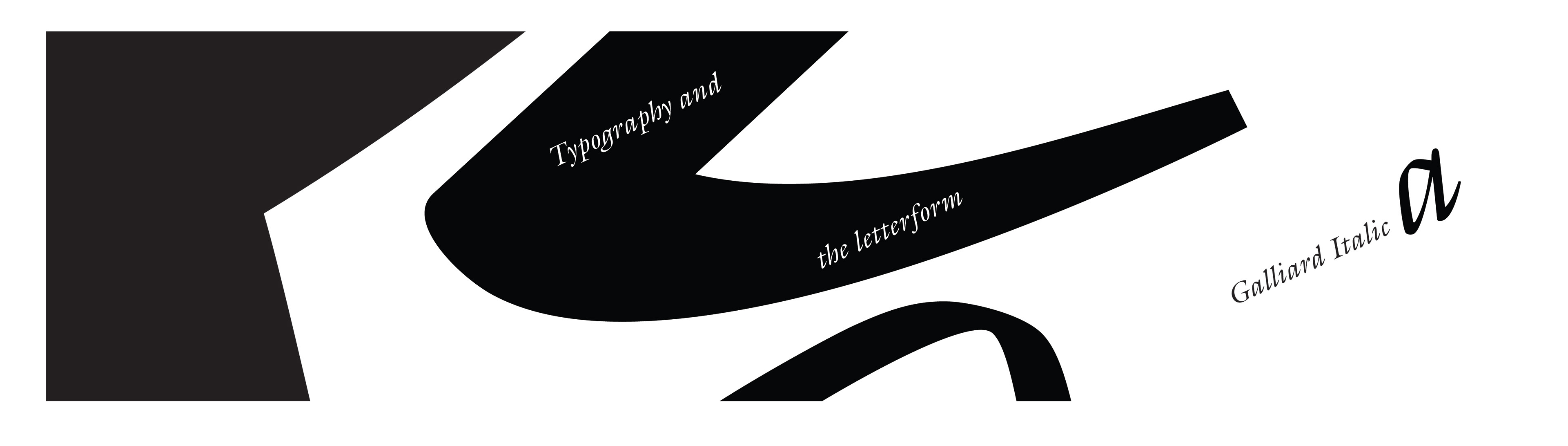
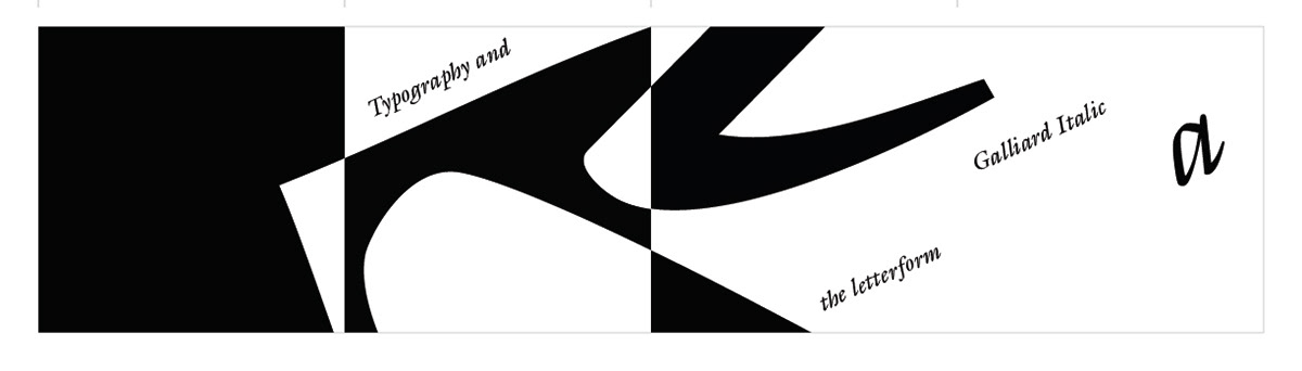
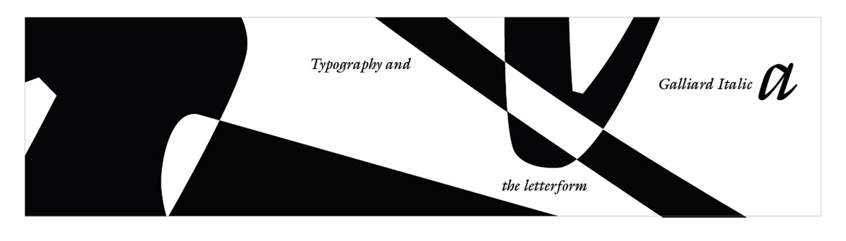
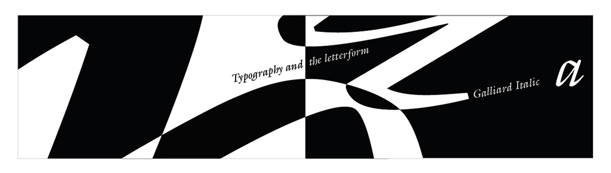
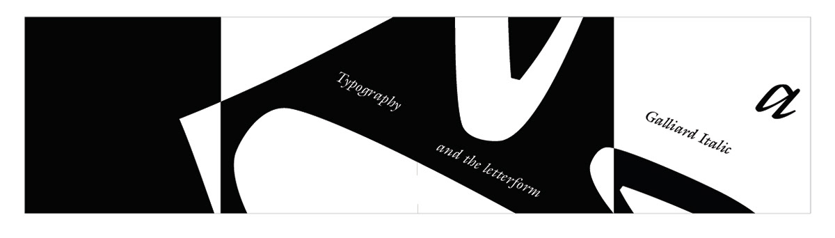
FINAL
Final designs and refinement of the four-panel sequence, personal choice top 5